Unlock the Power of Colour: A Guide to Finding the Perfect Colour Scheme for your Home5th May, 2025|
Your dream home starts with finding the perfect colour scheme and the perfect splash of colour! A carefully curated colour palette isn’t just about aesthetics—it shapes the atmosphere, sets the mood, and tells your unique story. The right hues can transform a space, making it feel warm and inviting, sleek and sophisticated, or vibrant and full of life. But with endless choices, how do you pick the ideal shades? Don’t worry—we’ve got you covered! In this guide, we’ll simplify the process, offering expert tips and inspiration to help you create a cohesive and stunning home interior effortlessly. Let’s dive in!
Spark your creativity

Before diving into paint swatches, start by sparking your creativity! Inspiration is everywhere—whether it’s the rich hues of a sunset, the elegant tones in a favourite piece of artwork, or the stylish palettes seen in fashion and travel. Gather images, textures, and colours that speak to you and build a mood board to bring your vision to life.
As you explore, notice recurring themes in the colours you’re naturally drawn to—this will guide you toward a cohesive palette. The more ideas you collect, the easier it becomes to pinpoint shades that complement each other and set the perfect tone for your space. Let your imagination lead the way!
Mastering the Colour Wheel: Your Key to Perfect Palettes

Unlock the secret to stunning interiors by getting to know the colour wheel! This essential tool is your roadmap to creating harmonious, eye-catching colour schemes.
At its core, the colour wheel showcases primary colours (red, yellow, and blue), which when mixed create secondary colours (green, orange, and purple). Then come the tertiary colours, formed by blending a primary with a secondary shade—think teal, magenta, and amber.
Understanding colour relationships is a game-changer. Want a bold, dramatic look? Use complementary colours—shades that sit opposite each other on the wheel, like blue and orange. Prefer a soothing, cohesive space? Try analogous colours, which sit side by side, such as soft greens and blues.
Once you’ve got the basics down, experimenting becomes effortless! The colour wheel helps you mix, match, and balance hues like a pro, ensuring your home’s palette reflects your style while staying visually stunning.
Set the Tone: Choosing Colours That Shape Your Space’s Mood

Colours do more than just decorate—they set the mood and influence how a space feels! Before picking your palette, think about the atmosphere you want to create.
Do you dream of a calming retreat? Soft blues, greens, and neutrals bring a soothing touch, perfect for bedrooms or relaxation zones. Want a space that energises and inspires? Bold hues like fiery reds, vibrant yellows, and dynamic oranges spark excitement and creativity.
For a luxurious and sophisticated feel, rich jewel tones like deep emerald, navy, or plum add elegance. Prefer something light and airy? Whites, beiges, and pastels open up a space and make it feel fresh and inviting.
Your colour choices define the mood, so take a moment to reflect on how you want your home to make you feel—then let the palette work its magic!
Light Changes Everything: How to Pick Colours That Shine in Every Setting

Finding the perfect colour scheme is vitally important, so before committing to a colour scheme, consider how lighting transforms hues throughout the day. Natural and artificial light can dramatically alter the way colours appear, so it’s crucial to test shades under different conditions!
Sunlight brings out the truest version of a colour, but keep in mind that morning light is cooler, while afternoon light is warmer and golden. North-facing rooms tend to get softer, cooler light, making some colours appear muted, while south-facing spaces bask in bright, warm light, making hues feel richer.
Artificial lighting plays its role too! Warm bulbs enhance reds, oranges, and yellows, creating a cosy feel, while cooler lighting sharpens blues, greens, and greys for a sleek, modern vibe.
Before making a final decision, sample your colours at different times of day to see how they shift—what looks perfect in the morning might feel completely different by nightfall!
The 60/30/10 Rule: The Secret Formula for a Balanced, Beautiful Space
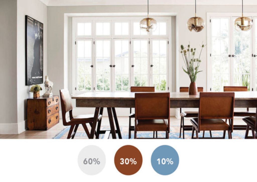
Want a foolproof way to create a visually stunning colour scheme? Say hello to the 60/30/10 rule—a tried and true design principle that ensures harmony in any room!
Here’s how it works:
- 60% – The Dominant Colour: This makes up the majority of the space—think walls, large furniture, or flooring. It sets the overall tone and acts as the foundation.
- 30% – The Secondary Colour: This is your supporting shade—used on upholstery, curtains, or accent furniture. It complements the dominant colour while adding depth.
- 10% – The Accent Colour: The fun part! This pop of colour brings personality to the space—incorporated through accessories like throw pillows, artwork, or decorative pieces.
By following this simple rule, your home will feel effortlessly cohesive—never too chaotic, never too dull! So, whether you’re opting for bold and vibrant or soft and serene, this approach ensures a flawless balance.
Build Your Perfect Palette: The Power of a Neutral Base

A neutral foundation is the secret ingredient to a well-balanced, stylish home! Starting with soft, timeless hues—like whites, beiges, greys, or warm taupes—creates the perfect canvas for layering in personality and colour.
Finding the perfect colour scheme can be achieved through neutrals which offer versatility—they pair effortlessly with bold accent colours and allow you to change up your décor without a full redesign. They also help spaces feel calm, cohesive, and effortlessly elegant while enhancing natural light.
Once your base is set, it’s time for the fun part! Add pops of colour through furniture, artwork, textiles, and accessories to bring warmth and vibrancy to the space. Whether you crave minimalistic chic or bold statement accents, neutrals provide the ultimate backdrop for endless creativity!
Elevate Your Space: The Magic of Textures and Patterns

A well-designed home isn’t just about colour—it’s about depth, dimension, and personality! Adding textures and patterns brings life to a room, transforming it from flat to fascinating.
Mixing different materials—like plush velvet, rustic wood, smooth metals, and soft linens—creates a rich, layered effect that feels cozy and inviting. Patterns, whether subtle or bold, help define the character of a space. Try geometric designs for a modern edge, floral prints for a soft elegance, or classic stripes for timeless appeal.
The key is balance—blend textures and patterns in a way that enhances your colour scheme without overwhelming the space. Whether it’s through rugs, cushions, wallpaper, or furniture, these elements add depth and visual intrigue, making every corner of your home feel thoughtfully curated.
Dare to Be Bold: Elevate Your Home with Fearless Colour Choices

Playing it safe is fine, but where’s the fun in that? Bold colours bring energy, personality, and unforgettable style to a space, making your home a true reflection of you.
The art to finding a perfect colour scheme could be a vibrant statement wall, rich jewel tones, or daring accent pieces can instantly transform a room, adding depth and drama. Whether it’s fiery reds, deep emerald greens, or striking cobalt blues, bold hues create a powerful visual impact and make a space feel dynamic.
The secret? Balance is key—pair bold shades with neutrals or softer tones to keep things sophisticated, or layer different bold hues for a high-impact, eclectic vibe. Go beyond trends, embrace your style, and don’t be afraid to take risks!
Steal the Spotlight!

Every great design starts with a standout element—your “pop piece.” Whether it’s a striking piece of artwork, a vibrant sofa, or a stunning rug, this focal point sets the tone for your entire colour scheme.
Once you’ve chosen your statement piece, build your colour palette around it. Pull colours from its patterns, textures, or dominant hues to create a cohesive look. If your pop piece is bold and vibrant, balance it with neutral tones to let it shine. If it’s more subtle, complement it with deeper shades for contrast and depth.
By working with this key element, you ensure your space feels intentional, stylish, and effortlessly put together. So, don’t be afraid to let your pop piece take centre stage—it’s what makes your home uniquely yours!
Choosing the perfect colours for your home can feel like an art form—but you don’t have to go it alone! A professional interior painting and decorating service brings expert guidance and creativity to the mix, helping you unlock the full potential of your space. With years of experience and a sharp eye for design, they can craft a colour scheme that complements your style and transforms your home into a masterpiece. Whether you’re aiming for bold and vibrant or soft and sophisticated, their tailored advice and services ensure your vision comes to life. Why stress over swatches when you can bring in the pros?
Ready to give your home’s exterior a fresh, new look? Let’s make your vision a reality! Call us today at 020 8546 4653 or fill out our online enquiry form to book your FREE consultation. Whether you’re dreaming of a bold transformation or a subtle refresh, our expert painting and decorating team is here to bring your ideas to life—flawlessly and professionally. Don’t wait—let’s add that perfect splash of colour to your home!